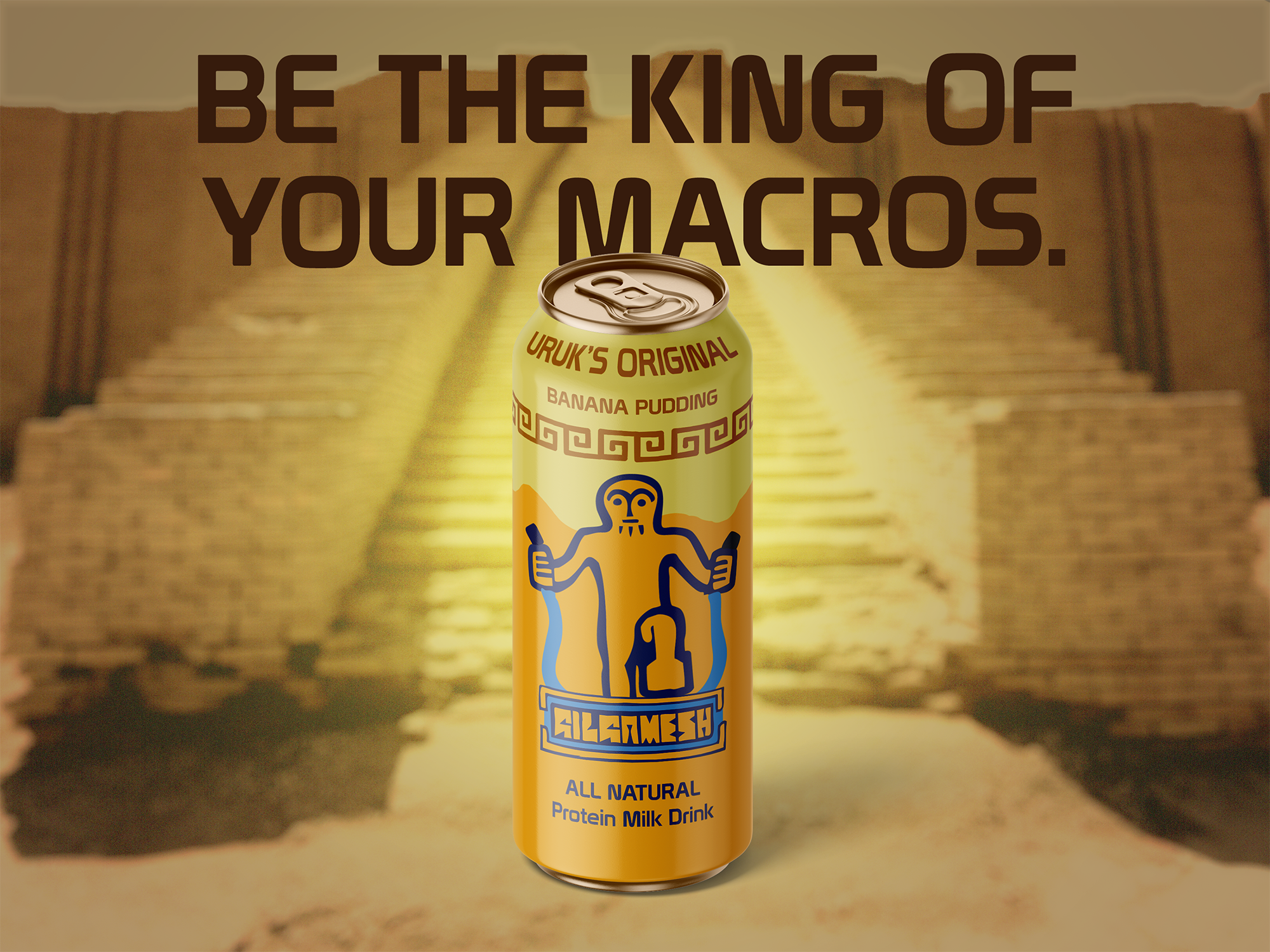
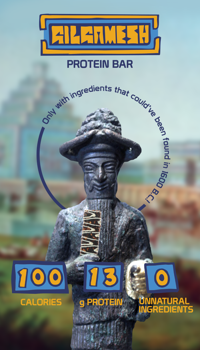
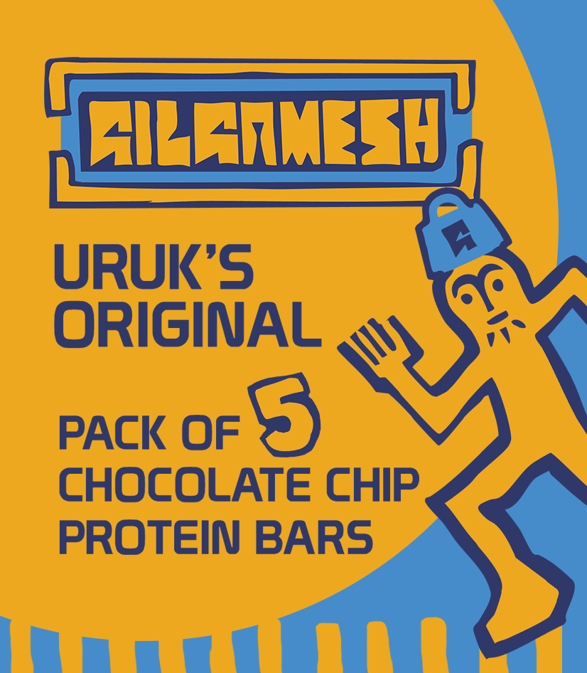
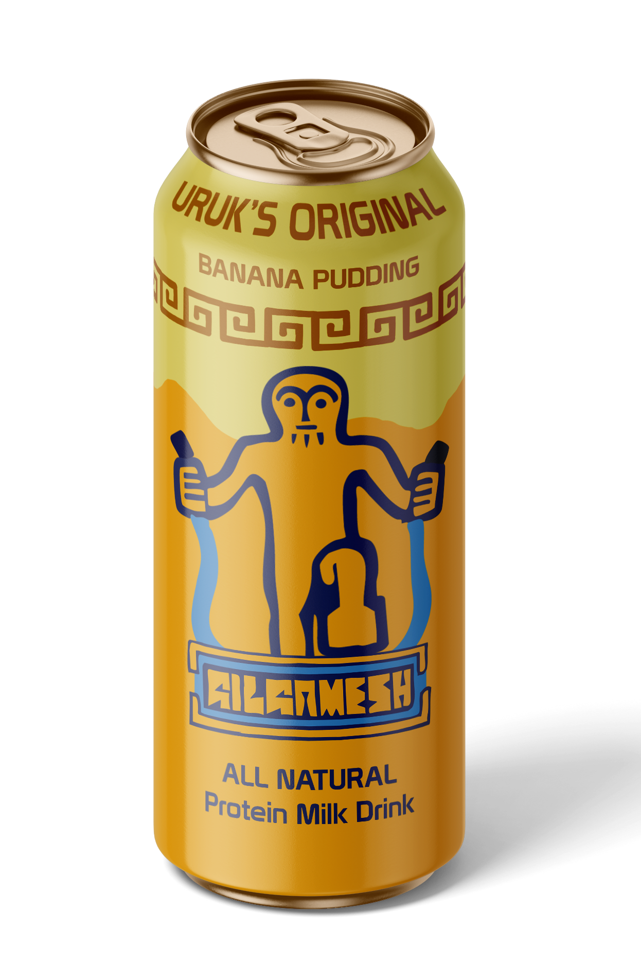
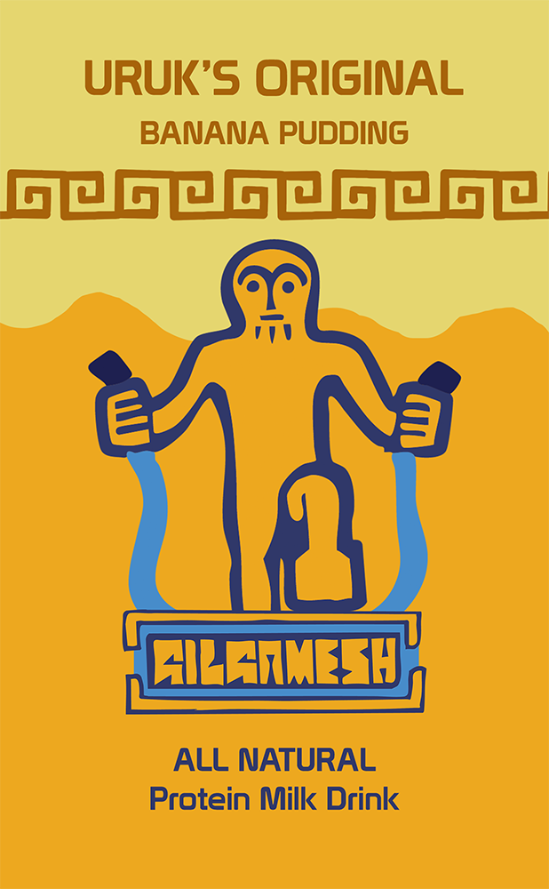
Protein bar packaging and branding designed around the mythological Gilgamesh. I took inspiration from mesopotamian sculptures, statues, and carvings. This kind of imagery was refined to match current design trends with protein and health products.
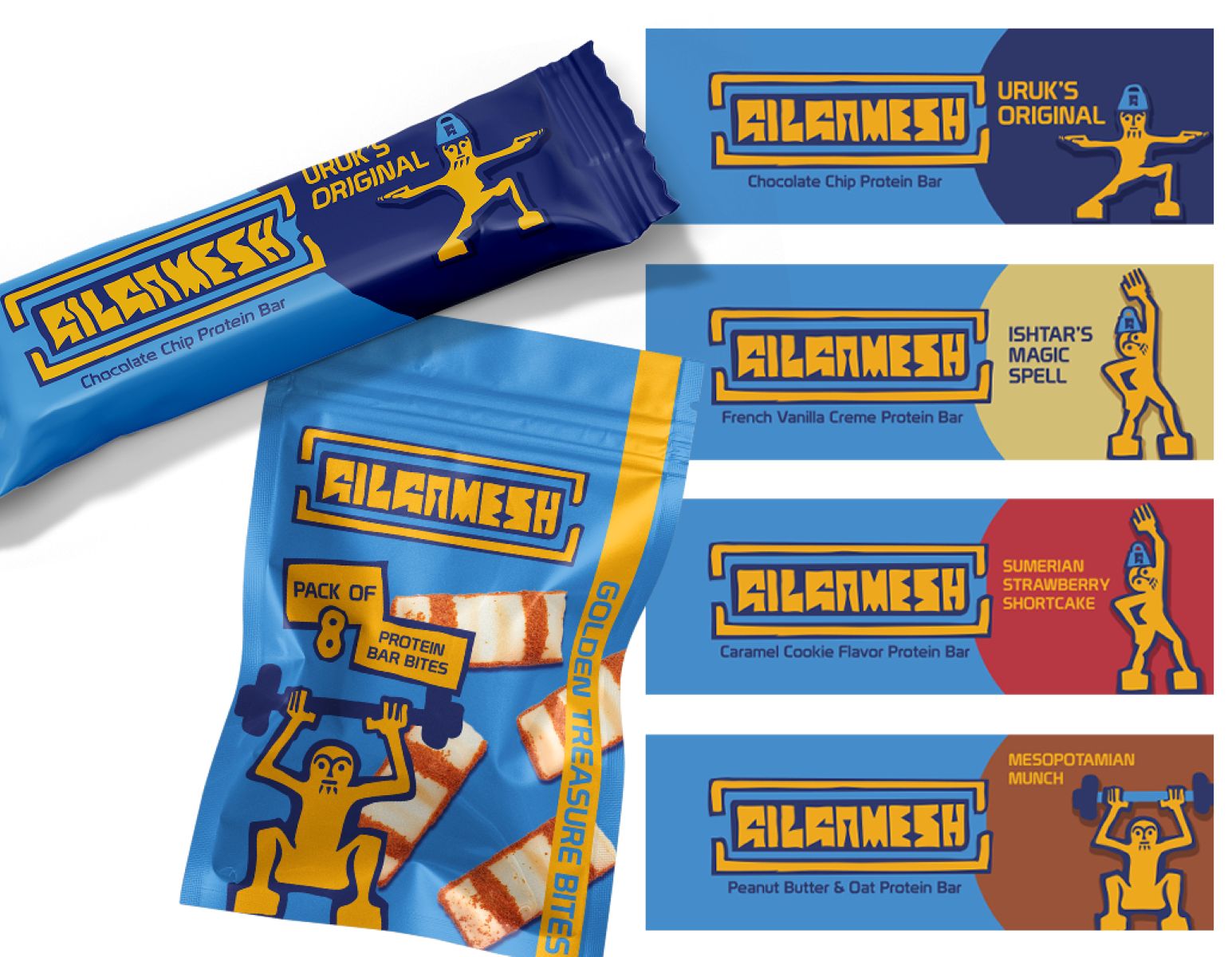
Concept & Drafting
A brand of protein bars with an identity represented by Gilgamesh, the star of the Mesopotamian Epic of Gilgamesh
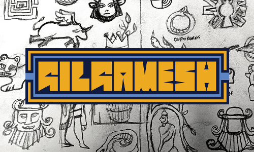
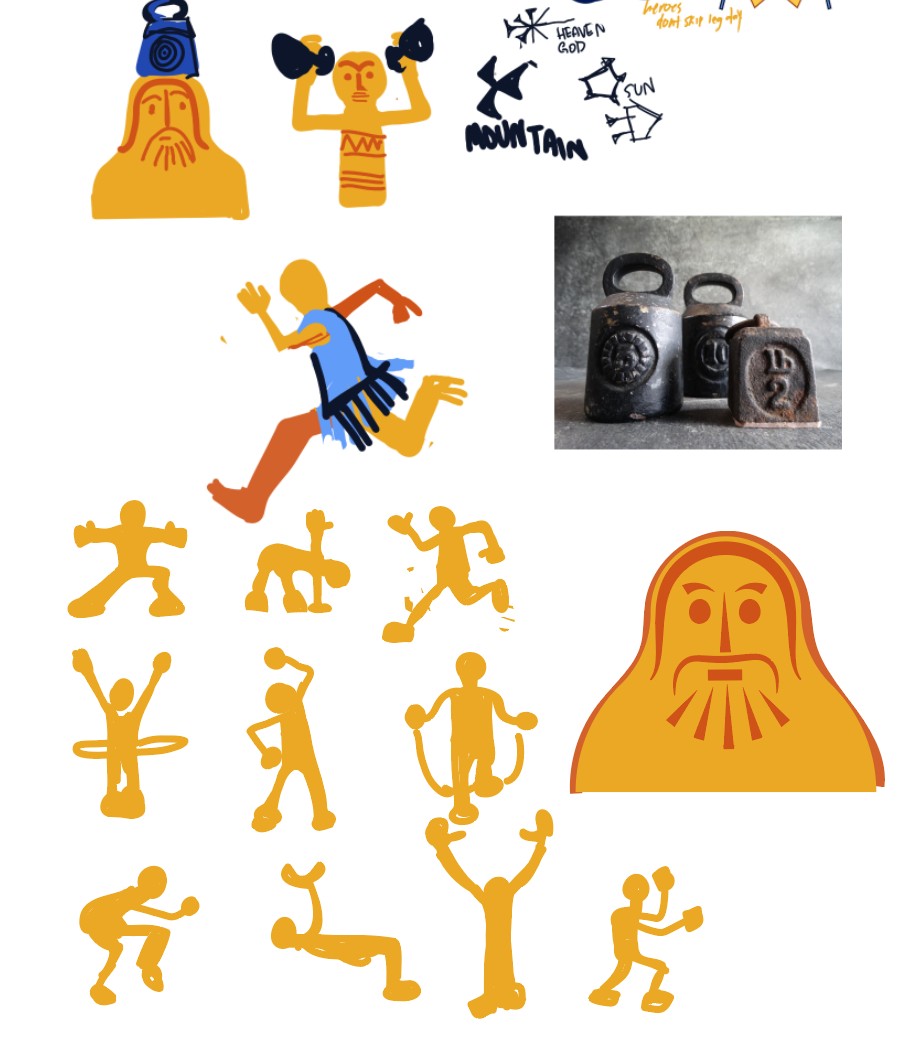
The initial assets were based on imagery that was taken directly from the text. I realized they weren't immediately recognizable, and they felt too serious.
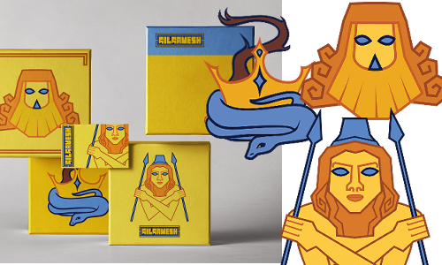
Revision
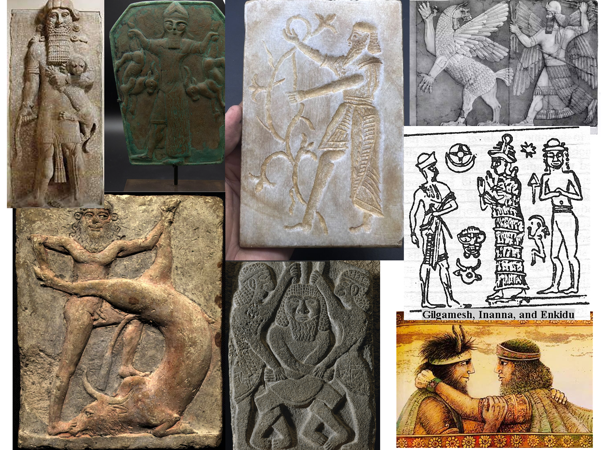
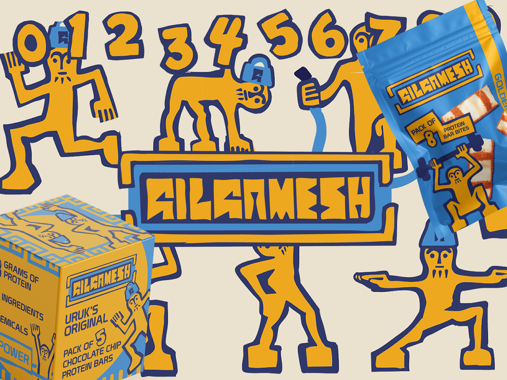
I decided to refine the visual style to become more cohesive. Returning to my references, I decided to channel the handmade, natural feel of ancient Mesopotamian artwork.
Asking, "How do I make the tactile feeling of ancient clay sculptures into flat marketing assets?"
I redrew the images, tracing on top of the linework, which took the perfect straight edges away while keeping the lines clean.
Audience
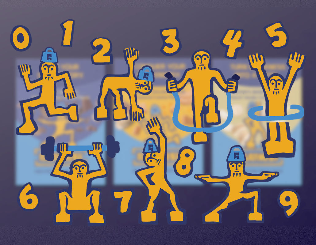
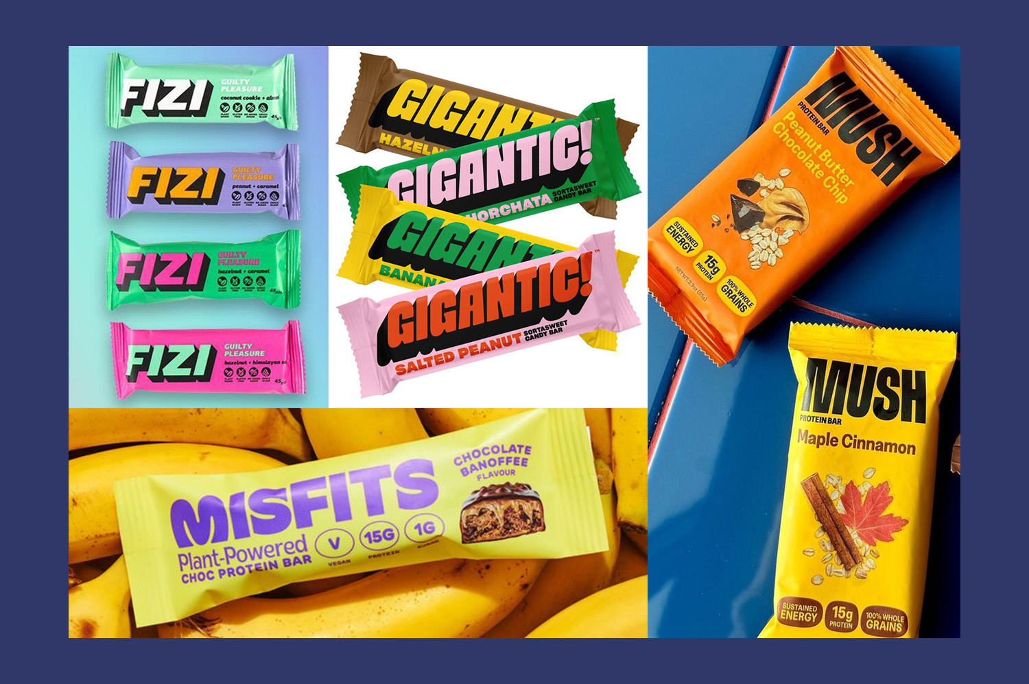
In researching other protein brands, I noticed they are reaching a broad target audience: generally young, active, and health-conscious. I decided to push the exercise/strength themes into a more playful light.
The target audience here isn't purely gym-buffs. Rather, people who keep track of nutrition want energy.
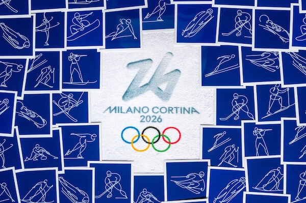
I saw the 2026 Winter Olympics designs for all of the sports' symbols, how recognizable the imagery conveys being active without involving the gym.
Character Design
Gilgamesh's appearance was never actually described.
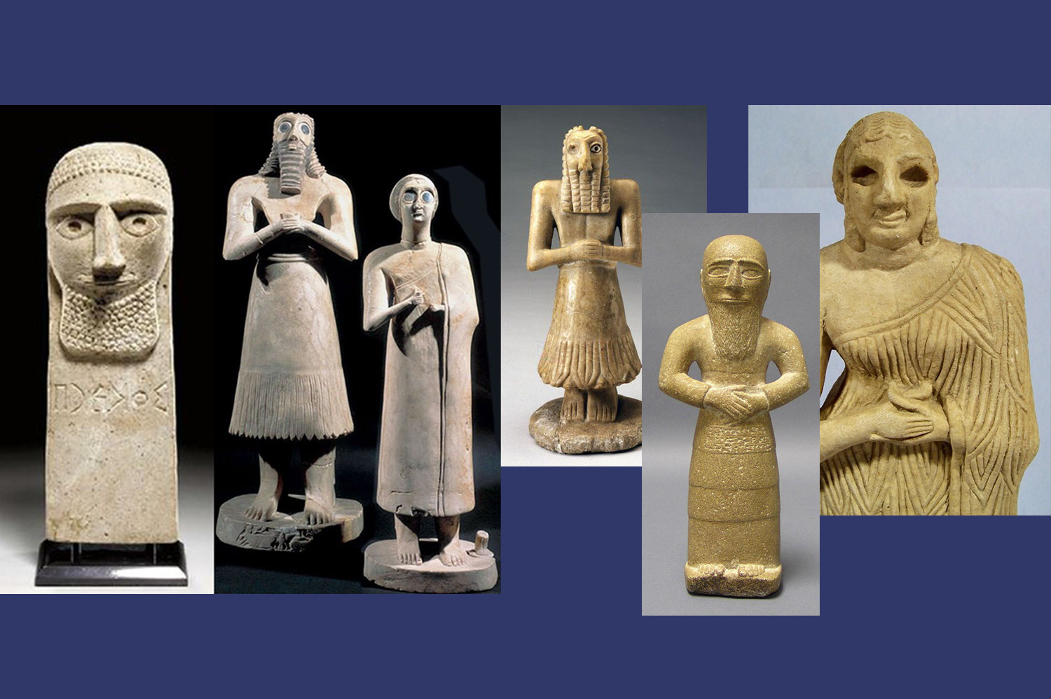
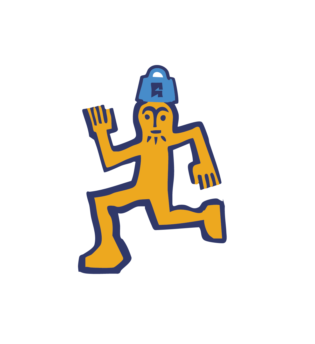
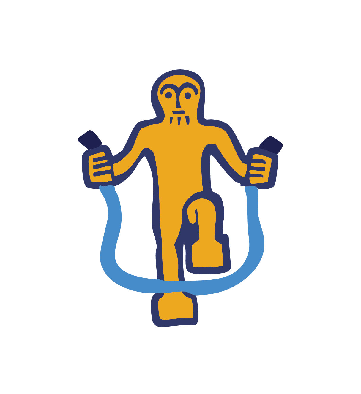
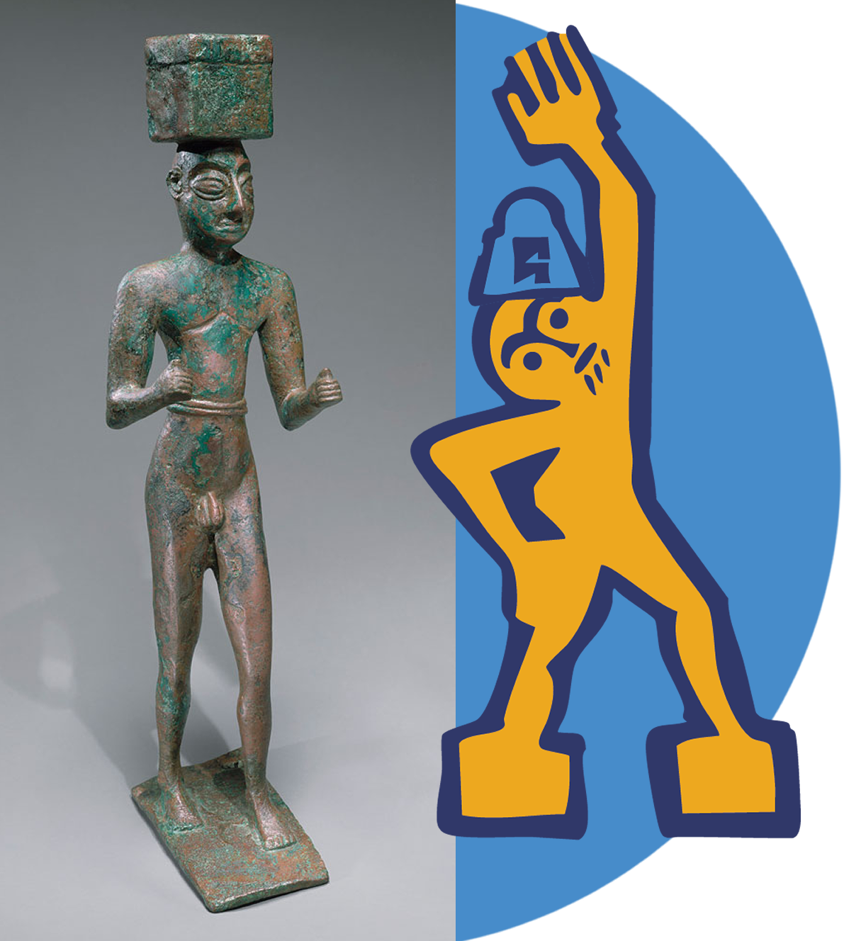
I collected images of Mesopotamian sculptures: exaggerated shapes and features carved out of stone. I knew these aspects could make it feel more primordial than rigid lines.
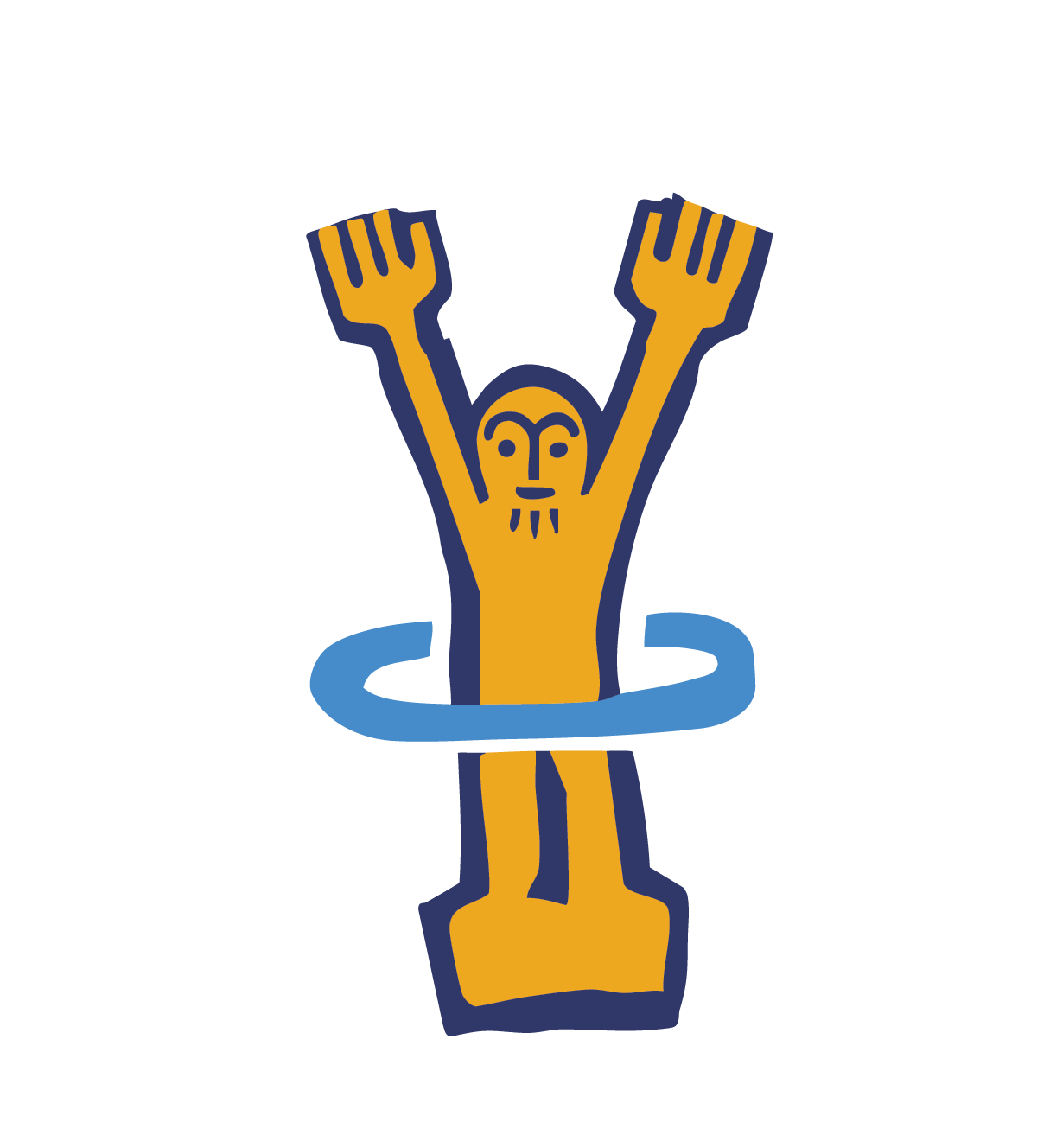
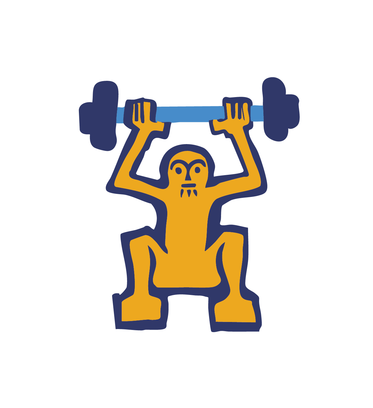
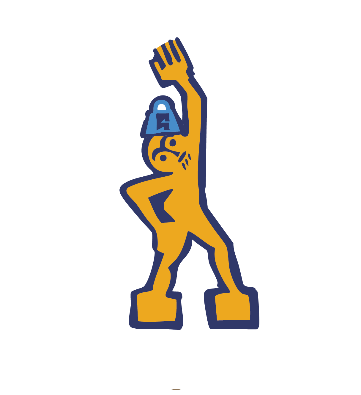
So, to create a cartoonish caricature of Gilgamesh, I used this shape language. Receiving guidance, I was suggested that the characters should be performing an action. Give them context to fit naturally into the brand.
Finals
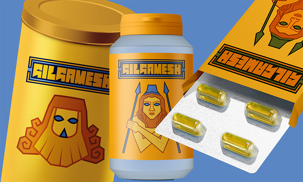
Gilgamesh encapsulates exactly what I was going for. I feel that this branding represents the cultural shift in branding for fitness products.
Earlier in the 2000's, fitness branding was extremely masculine, and general "health" goods would be more feminine or clinical. Recent design trends have encouraged product design that is friendlier to the customer. Heavily gendered imagery is becoming outdated as well; design shouldn't push away certain demographics.
I like this trend when it comes to grocery store food products. I wanted to channel that casual, but appealing energy. I believe I accomplished that!