THIS IS REMY'S
Personal Branding
BRAND IDEA
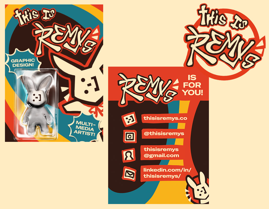
Branding designed to convey who I am: as both a person and a designer.
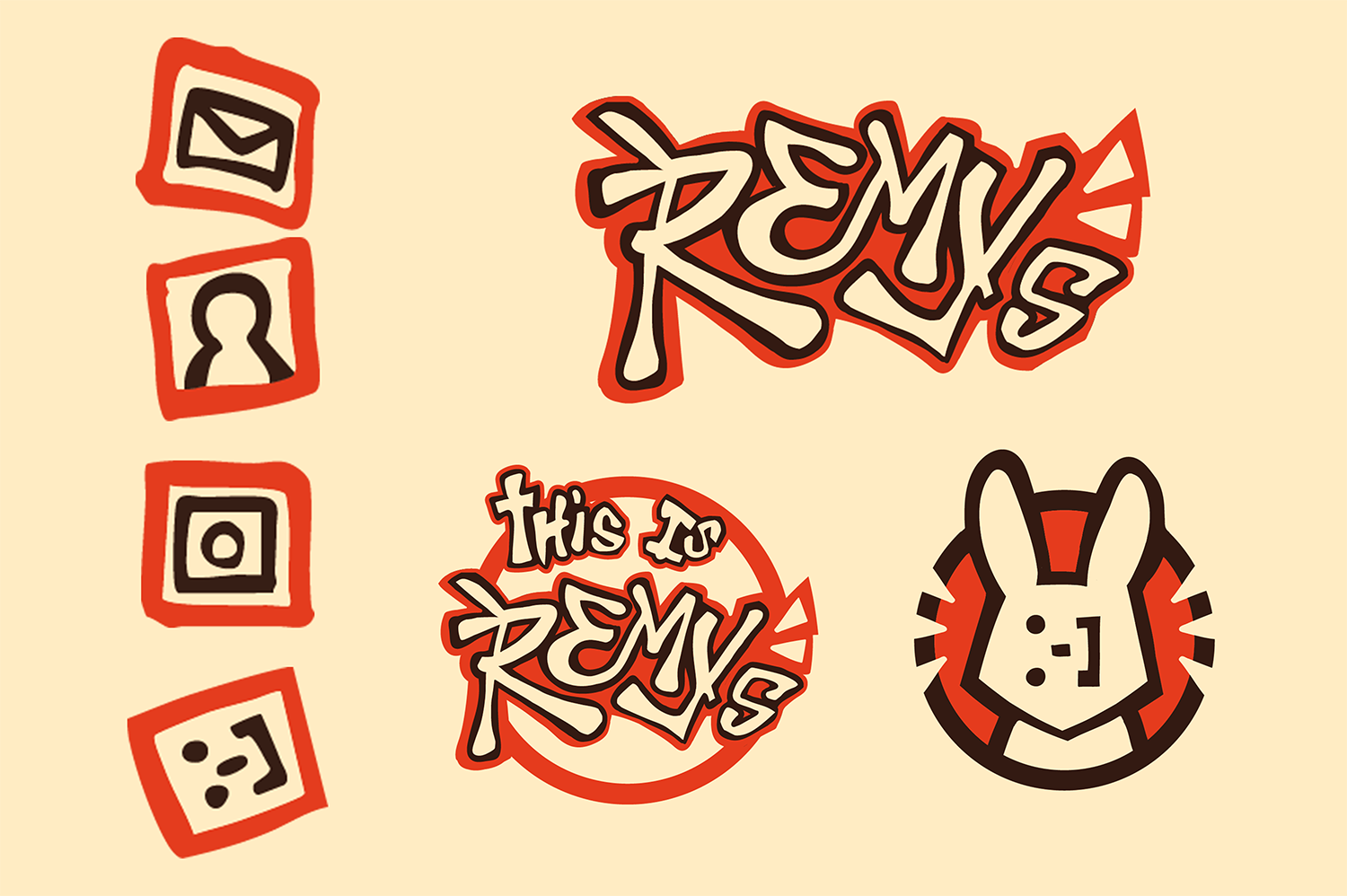
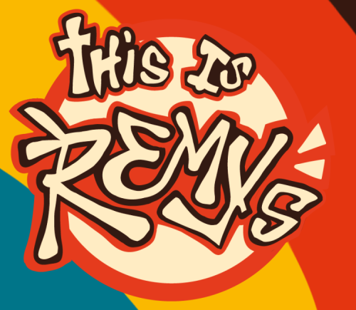
I wanted to go for something different than just my name, so I decided on "This is Remy's".
I like how it makes a triple entendre: "This belongs to Remy" / "This is Remy S(chmitz)" / "This is a lot of Remys."!
CONCEPTUALIZTION
As an artist, design can get personal, I need to present exactly who I am as a creative; while not discrediting myself professionally.
I knew I was going to compile all of these elements that have repeatedly shown up in my personal work: bright, primary colors, rabbits, and illustration.
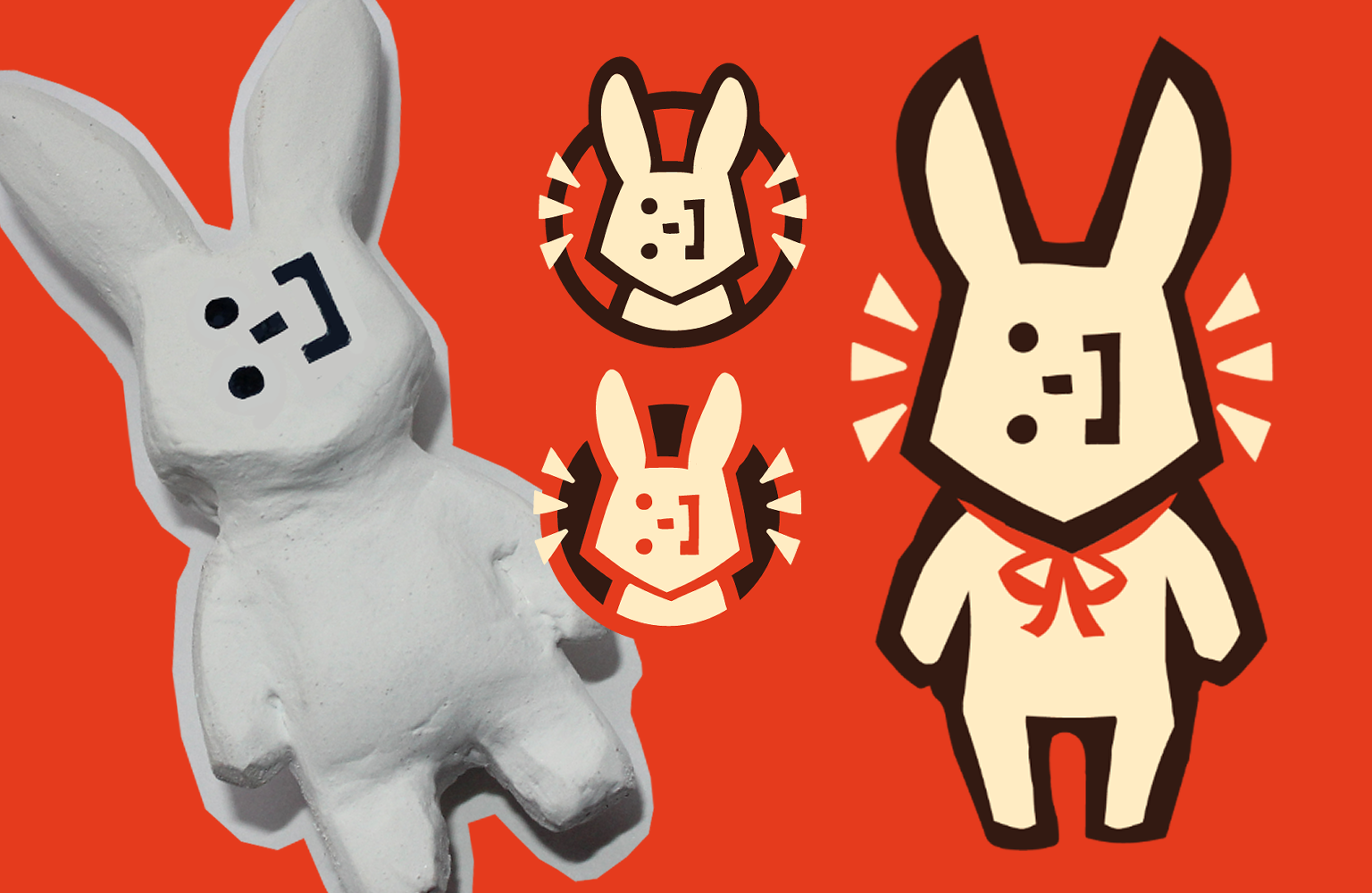
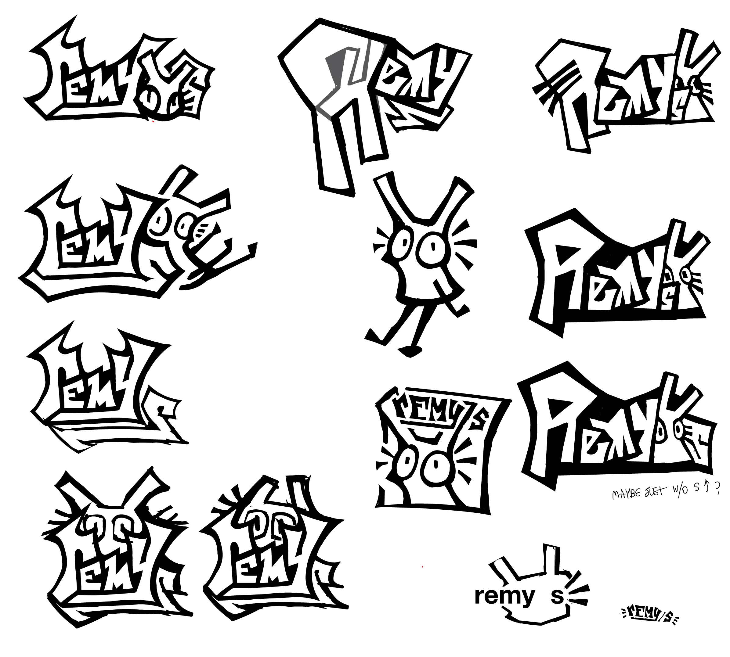
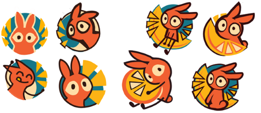
From there, I was dead set on making a rabbit mascot. Rabbits are important to me because they are universal symbols of luck. I like the dichotomy between rabbits and hares.
Bunnies are soft, clean, and domesticated. Hares are rugged, primal, and feral. I compare this to my approach to design. I design cleanly and professionally, brandished with an authentic touch that makes it human.
Drafting
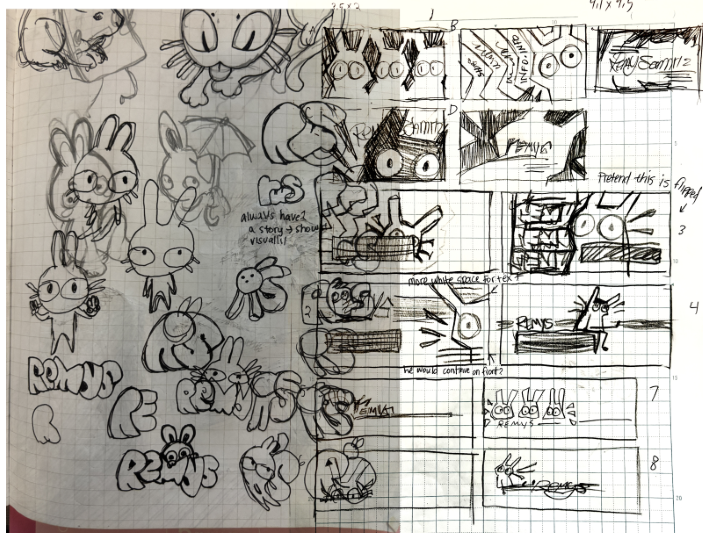
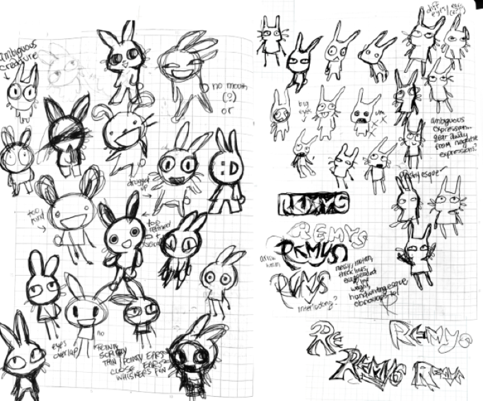
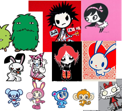
I collected references from everything that inspires me. Clearly, I cannot overstate how inspired I was.
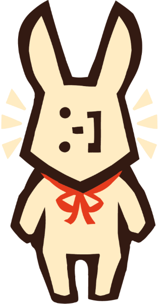
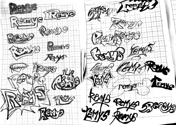
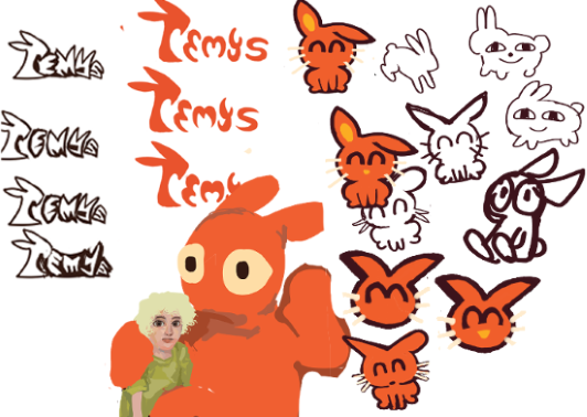
My sketching process here consisted of drawing every idea as it came to mind. I did this until I found the direction I wanted to take.
When I'm seeking feedback at beginning stages, I like to have plenty of material to present. This way, I get to survey what works with my sample audience.
1st Iteration
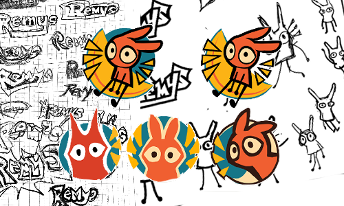
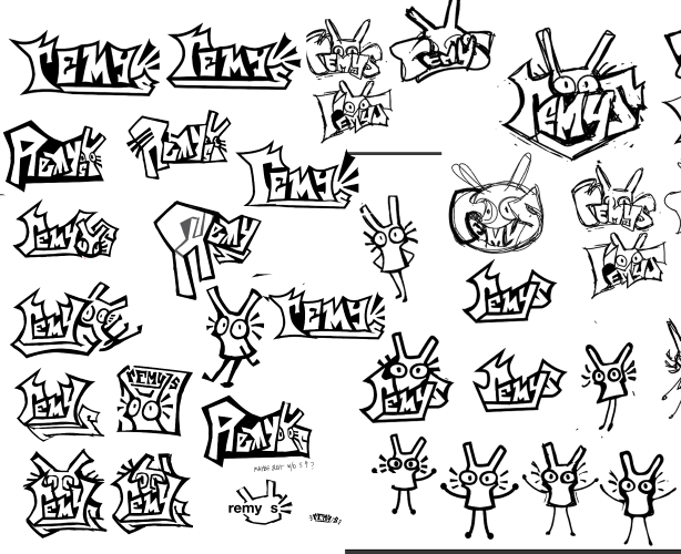
I wanted to represent myself as accurately and personally as I possibly could. I'm not usually a perfectionist, but I was never satisfied with this one, so it went through quite a bit of re-do's.
The first concept began with building the foundation of the style. I was vividly inspired by simplified mascot characters from the early 2000's, but I got frustrated because I couldn't capture that imagery.
2nd Iteration
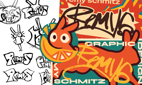
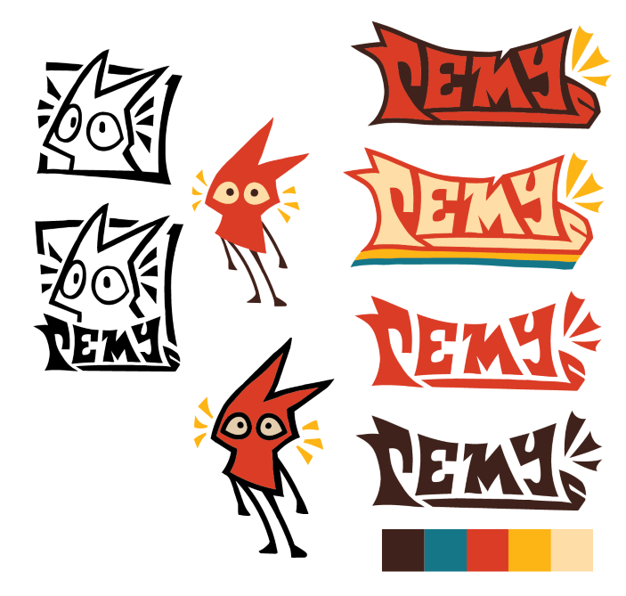
I now took a step back and felt like I had taken too much feedback. Doesn't that seem ridiculous? Though, this project is for me, and I no longer felt it was my own.
I restructured the style's foundation, refrencing my original ideas.
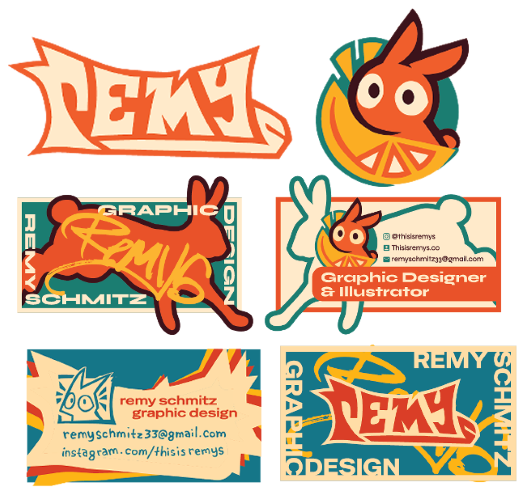
I wanted to add an orange, because oranges symbolize many different things that are important to me. When another designer asked me to explain my choices, I felt like I couldn't really explain. I overcompensated trying to make it more personal, that I made it too personal.
Final Iteration
Most projects should end here, but when the time came to print, I became aware of my hesitation.
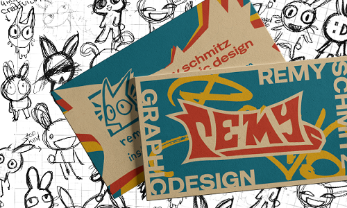
So I revisited it again. I needed to find the middle ground between personal and professional.
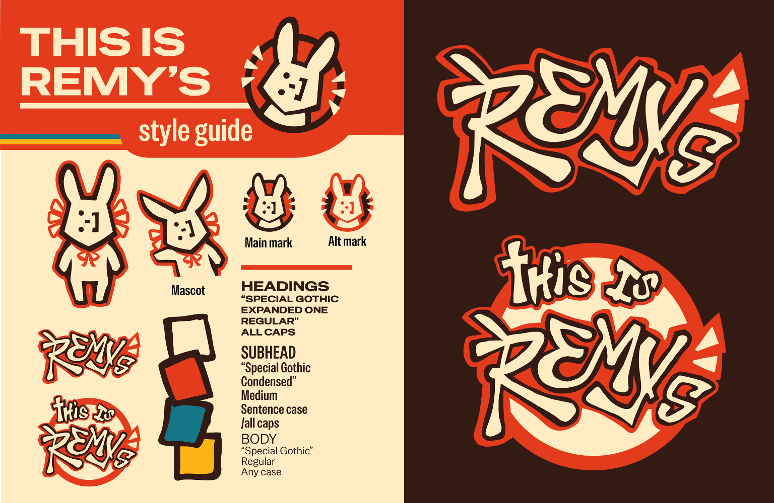
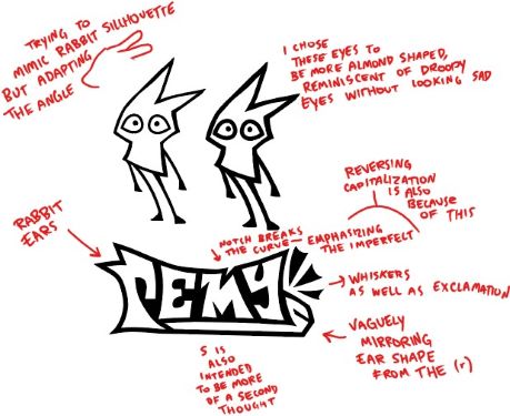
I took everything that was successful from the previous attempts and compiled them into an identity that was consistent.
I'm confident to say I'm satisfied! This is Remy's is stylistically represetative of my identity.